Spotify Podcasts: High Fidelity Mockups and Putting it All Together
- Tammie Meloy
- Jul 14, 2021
- 4 min read

I have a confession to make. I was in the car driving yesterday when the question hit me:
My brain: What day is it today?
Me: Tuesday
My brain: Did I finish my job hunt requirements on Sunday? (For those of you that don't know, Flatiron requires certain things of us every week by a certain deadline- including writing a blog post.)
Me: Crud (Although I'm sure I didn't say crud, however, this is a professional blog post so we'll keep it G.)
My brain: … Crud.
And with that, my attempt at maintaining any potential money-back status went down the drain.
That's okay- I'm sure I'll nail that position...soon I hope.
With that, let me introduce our subject for this post: the wrap-up of the Spotify Podcast project. (It couldn't have come at a better time, honestly, as there are some personal things I need to focus on for the next week or so. Then I can return to focusing on design work and serious job hunting.)
So Spotify- two weeks ago I did some sketch work and some wireframing. Last week I started working (slowly) on high fidelities. Normally, this would not take me nearly as long as it did. However, we (as in me and the other team working on this) could not find the Encore Design System online, so we had to recreate it as best as we could. That wasn't as bad as the heavy downloading of images. I tried to use official Spotify images where I could. Otherwise, I just grabbed some from Unsplash (one of my favorite sites, by the way).

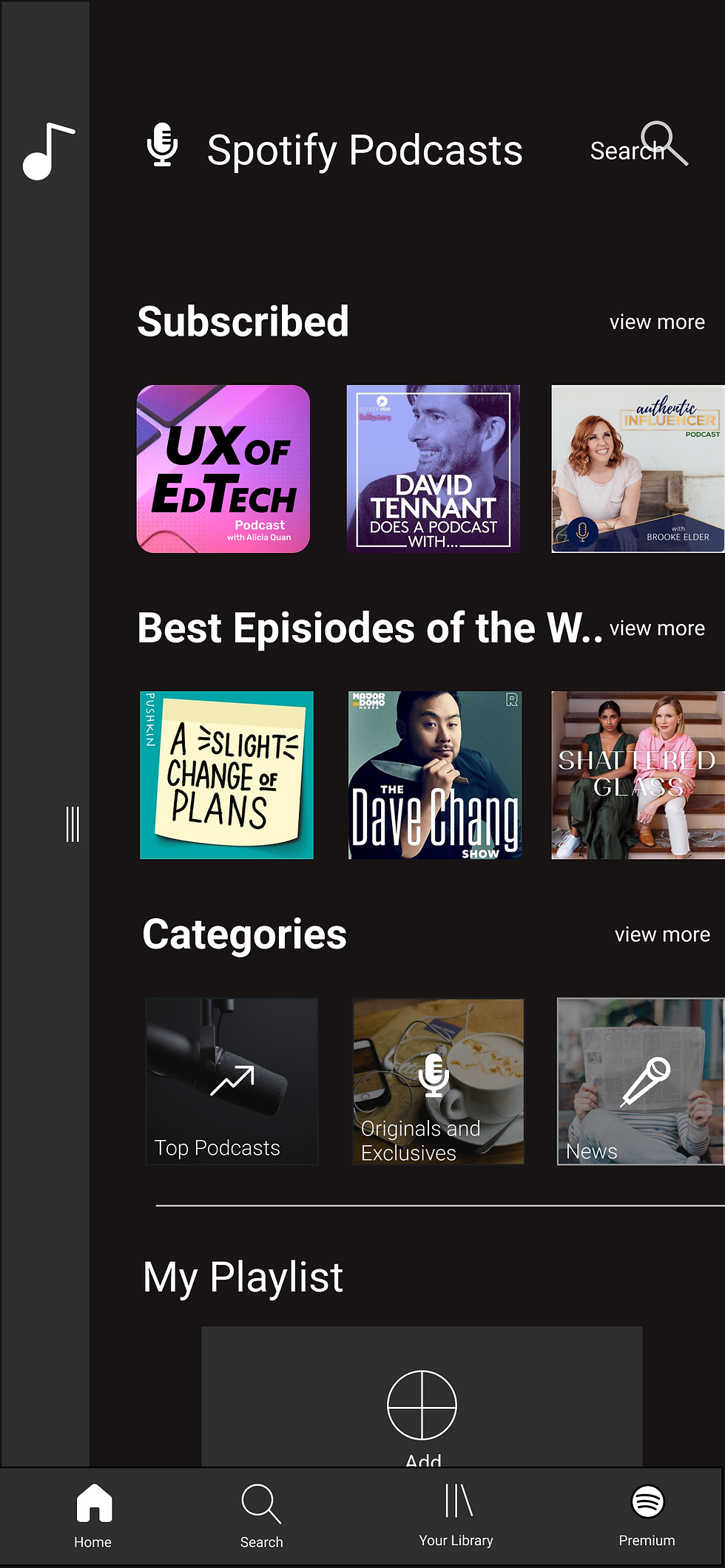
Other pages look similar to existing pages, just with the addition of the opposing panel to the side, available for swiping.

Solutions
Previously identified problems: Good design is all about solving problems. A quick survey quickly identified some of the issues with Spotify Podcasts: no hierarchy or organization and too much clutter kept the user from finding what they are looking for; you could not view or search for all podcasts within a certain category within a genre; the app failed to notify when a new episode of your favorite podcasts dropped.
Organization: Separating music and podcasts into separate panels makes finding and organizing their choices a breeze. Creating a separate podcast playlist by adding chosen podcast episodes allows for the user to preplan their listening, and keeps them separate from their music playlist, as was one user complaint.
Different options were explored including tabs, separate apps altogether, and "Netflix-ifying" it (providing an extra screen asking the user what they are wanting to listen to, music v. podcasts, similar to the Netflix onboard screen asking the user what account they are wanting to use).
Why panels?
It's modern. Swiping in an app is trendy among other apps such as Tinder and TikTok. It's a motion that is familiar to users.
It's clean. Tabs would add extra clutter to the screen. Separate apps would require additional space on the user's phone, which is typically at a premium, not to mention having to leave one app to open another if the user wants to change their listening experience. We don't want the user leaving our app. Having an additional onboarding screen may work, but then a solution would need to be designed if you wanted to switch while listening. A swipeable panel solves all these issues.
It's engaging. Users instantly get a response from the program and are "touching" the app physically for longer. Users are then rewarded by what they want- switching from music experience to podcast experience in a seamless way, where both are organized to suit their needs.
Limited Ability Search: Podcast owners would now be able to add multiple category tabs to their podcasts. With that superpower, listeners should now be able to search, not only by title, name, album, etc., but also by CATEGORY. So, for instance, if I am searching for "design" podcasts, not only will it return every podcast with the word "design" in the tile (which it does now), but will also return every podcast with the "design" category tag selected. Or, another example- let's say you like listening to True Crime, specifically "cold case files". A particular podcast owner, say Unsolved Mysteries, can use the tag "Cold Case" on their podcast. Cold Case isn't anywhere within the name, but you search "Cold Case" and, BAM, Unsolved Mysteries is returned in the search. (Cue fireworks:)

Notifications: This one is simple. Toggling on/off a notification bell within the subscribed podcast would push notifications. Technically the bell is already there, so just a programing fix should allow for push notifications, as long as the user grants the proper permissions.

I know you want to see it in action. It's a sharp app. It's cool. It's trendy. It's clean. Everything is exactly where you want to see it. Subscribed or your playlists come first, as they should. Featured music/podcasts come next. Genres and categories come next. It's expected.
It's Spotify.


Comments