Outshine Customer Feedback Platform- Sprint 4
- Tammie Meloy
- May 9, 2021
- 3 min read

During Sprint 4, individuals including myself designed mobile screens for the Outshine app. More user testing was completed on the usability of the app. We also attempted micro-interactions within the app to increase user engagement and understanding of data.

During this final sprint of the project, the team members were expected to present mobile designs of the app. I decided to use a responsive design to create the mobile version. As a result, the phone app looks very similar in format to the original tablet screens.


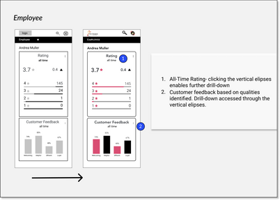


The design system remained consistent here within the mobile screens. After the initial draft, any inconsistent spacing was also tightened up as well.
User Testing- Round 3
The users were tested for a third and final time on the usability of the apps presented by the team. Where possible, one person presented as the role of the interviewer and one as note-taker for the team. Where this was not possible to do, we recorded the interview using Zoom and used Otter.ai for notetaking.
Users were tasked with checking the progress toward the daily goal and growth opportunities for Andrea Mueller.
Takeaways
Testers found the application easy to navigate and were able to provide positive feedback along with some areas for improvement. Users enjoyed the familiar drop-down hamburger menu navigation style and felt that the layout was clean and easy to navigate. Ease of navigation is one that was mentioned by users many times over.
"Valuable information that’s easy to navigate through the navigation menu." -User Tester
Microinteractions
Microinteractions for the OutShine app focused on a logo animation for splash screens, graph animation for engagement, and real-time feedback scrolls.
When done properly, microinteractions can not only be enjoyable for the user and increase engagement, it can also provide positive and negative feedback.
For the sake of space, I am only including the graph animation here.
Final Handoffs
For the final handoff, we were asked to craft a design system for the project.
Final Reflections
My final reflections that I wrote at the end of this project:
What big wins did you have this sprint, and what contributed to them? I was proud of my design mockup, and how professional it came out looking. However, I did one further iteration for the ease of creating my design system and for handoff, and I realized that my fonts still lacked consistency. Once I made the necessary changes towards consistency for my design system, the app looked even more “professional”. So, I now feel confident in my ability to utilize a responsive grid in my design work plus the consistent features of Sketch (symbols, which I’ve been using for a while, and font style. I will be interested to learn how layer style works within Sketch as well.
What were your main challenges in this sprint, and how did you handle them? Again, time and personal challenges I believe...more than anything directly related to the sprint itself.
What would you do differently next time? I’m looking forward to Phase Four and dealing with the client we have been assigned. I will be sure to step into more of a leadership position (all while maintaining balance within the team- when I say leadership I’m looking more at my confidence level and understanding my offering has value more than anything else), and rely on Sketch features and grids to continue to provide a consistent, professional product.

Comments