Outshine CSM tool: user research and designs for mobile and tablet customer service management
- Tammie Meloy
- Apr 18, 2021
- 3 min read

Overview
Outshine customer feedback platform is designed for boutique managers and trainers to track and maintain customer experience feedback.
Problem Statement
To further differentiate the platform, the team was asked to design a more refreshed look and feel for the manager administrative portal that improves store managers’ ability to easily reference associate and transaction insights at-a-glance and then determine employee training opportunities.
Users and Audience
On the retailer side, the stakeholder wants to target regional store managers and boutique store managers at a variety of small- to medium-sized retail chains that rely on quality customer service as a brand differentiator. On the consumer side, the stakeholder wants to target a wide range of retail shoppers that include male, female, and non-binary adults ages 18-60, with varying levels of interest and experience in retail shopping.
The focus of this project will be on the store manager users as they are the primary users of the manager administrative portal.
Roles and Responsibilities
This was a team project with each member responsible for their own designs. Team members shared interviewing and research responsibilities.
Scope and Constraints
The timeline for project completion was 6 weeks. Tablet and mobile screens should include an overview, feedback, breakdown by employee, and real-time data.

Sprint 1: Research and Style Tiles
Step 1-Domain Research and Competitive Analysis
Researched direct competitors such as Thryv, Salesforce, Survey Monkey, and Hubspot and evaluated factors such as their brand tone, design, and features.
Takeaways
Brand tone trends within the market included friendly and clear, with a focus on the client. Some focused on beauty while others sought out to be innovative and trustworthy.
For design and layout, most used cards as an easy means of organizing information. CTAs were bold and easily recognizable. Navigation varied between sidebars and tabs. Iconography was almost always personalized to the brand.
What was important is that customer feedback is instantaneous. "At-a-glance" metric reporting using graphs and charts were also key in providing important information as quickly as possible.
Learnings and Application
I have learned that perhaps the easiest way to do visual competitor analysis is to search that particular brand's Style Guide, which is typically made available to the general public on the internet. I can typically find their brand tone in their own words, plus be able to see CTAs and layout hierarchy all in one place. It makes completing a visual analysis somewhat quick and easy.
Step 2- Moodboards and Style Tiles
Each member of the team was responsible for creating three divergent style tiles, then selecting one for user testing.
My initial mood board offerings were (1) a coffee shop vibe, (2) a sunny, fresh, fun feel, and (3) a clean, classic black and white inspired by high-end boutique stores.


From these mood boards, I developed these style tiles. As much as I loved the "Hello Sunshine" mood board, the yellow came across as brownish and I did not like it as much. Had I more time to develop it, I would have explored different colors and features.

The "Coffee Shop" was the style tile I tested with users, however, it did not test well. Users felt that the style was "boring" and reflected an early, outdated Instagram style. The colors were bland, and the font sizing was too small.

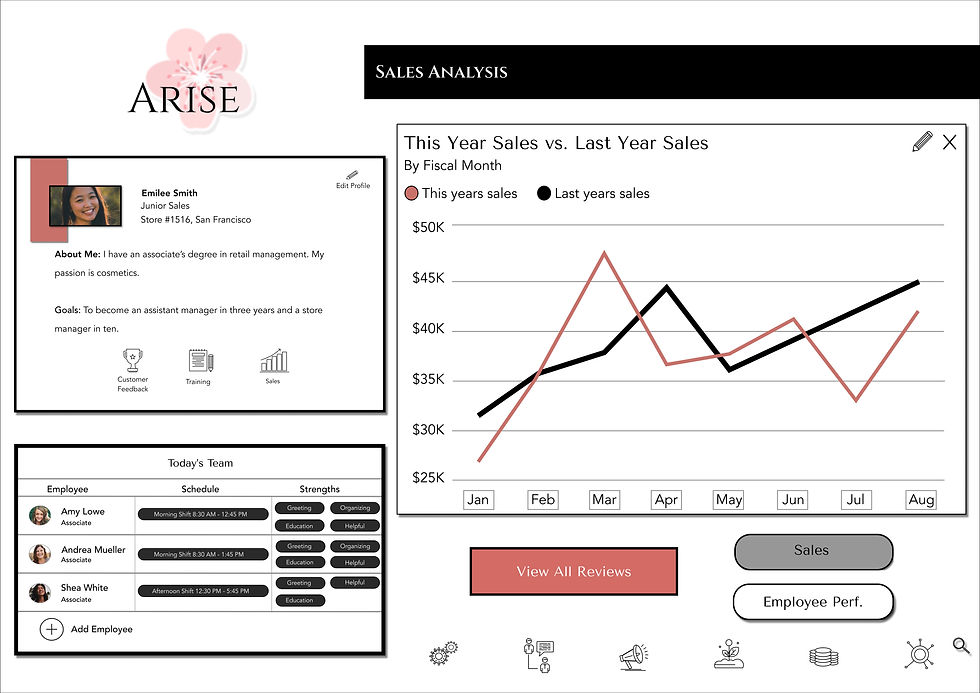
I decided to go with a bolder, stronger color palette that was classic and reflected the style of some recognizable high-profile boutique stores. Also, fonts were chosen to be professional, yet strong and modern.
Learnings and Application
Even though I use Adobe Color to pull out color schemes from my mood boards, I have learned not to rely on it. While it is a helpful tool, in the end, it is just what it is- a tool. Also, the more examples of features, the better.
Even though I enjoy making mood boards, admittedly mood boards and style tiles were some of the things I struggled with the most in my learning. I learned that I want to learn more about color psychology and leaning on that more when developing style tiles and designs.


Comments