
Spotify Podcasts
Solving search and playlist issues for the podcasting listener
Spotify has now launched podcasts within its platform. But is it intutitive?
I'm not sure what to put here so this is going to be a space holder for now.
In this Clicked.com project experience, I became a one-person UX research and design team tasked with making the podcast user experience friendlier.
Problem
-
Audio Quality: Some users have expressed concerns about audio quality, particularly when listening to older podcasts or those that were not originally produced for digital distribution.
-
Episode Management: While Spotify's episode management features are generally good, some users have requested additional customization options, such as the ability to create playlists or collections of podcasts.
-
Discoverability: While Spotify's recommendation algorithm can be helpful, some users find it challenging to discover new podcasts, especially those from smaller or niche creators.
-
Ad Experience: The frequency and relevance of ads can vary, with some users finding them intrusive or irrelevant.
Solution
For our limited time for the project, I selected two of these issues to work on, specifically Episode Management and Discoverability. A potential solution to these issues could be a more robust podcast discovery and curation feature. Spotify could implement a system that allows users to create personalized podcast "collections" or "playlists," where they can group episodes from different shows based on themes, interests, or specific topics. This would provide users with greater control over their listening experience and help smaller or niche creators gain visibility by allowing users to discover their podcasts through curated collections created by other users. Additionally, Spotify could enhance its recommendation algorithm to better account for user-generated collections and preferences, ensuring that users are exposed to a wider range of podcasts that align with their interests.
I also designed an alternative UI that will assist the user in managing their podcasts.
The Spotify Story
Spotify is a Swedish audio streaming and media service provider founded in 2006 by Daniel Ek. Spotify kicked off its venture into podcasting in early 2019, after acquiring podcast companies Gimlet Media, Anchor, and Parcast. (CNBC, 2021) However, analysts are stating the venture is failing, as measured by app downloads and Premium subscriptions.
356M
Active Monthly Subscribers
1B
Downloads
165M
Paying Subscribers
€2,168M
Tools
-
Figma and FigJam
-
Slack
-
Zoom
Team
-
UX: 1 Researcher, 1 Designer
-
Project Manager
Timeline
-
Overall: 4 weeks
-
Discovery Research: 1 week
-
Design and Testing: 3 weeks
Meet Sam and Emma- Spotify Users (Personas)
We wanted to gain a deeper understanding of our users' goals, needs, experiences, and behaviors. Based on a combination of secondary user research, diary studies, and heuristic evaluation, I developed two separate personas or user archetypes. This helped focus on the users' pain points and force empathy by putting "a face" on them.
I combined my proto-personas with archetypes- understanding that there are a variety of types of people who use Spotify, such as those who listen to their music while they work, those who listen while they work out, and those who listen while they relax. Users can be a combination of all three. These are just offered as examples.


Sam and Emma encountered common problems shared by many users. To identify the major issues with Spotify, I conducted a diary study. After compiling a list of these issues, I performed a heuristic analysis using Jakob Nielsen’s questions to avoid bias. Specifically focusing on Spotify’s podcasting capabilities, I assessed the website for usability issues. The identified issues were documented, and recommendations were taken into account for the redesign.
How easy is the app to operate? (Heuristical Analysis)
Clarity
-
Podcasts and music are separated by row- but rows are mixed.
-
Row titles and some card titles seem arbitrary.
-
No clear hierarchy.
Removing Friction
-
Need to clear the music queue to add podcasts.
-
Users aren't being notified when a new episode drops for a subscribed podcast.
-
Can't auto-download.
-
Downloaded podcasts won't play offline.
Relevancy
-
Not much information is provided on podcasts from the front page- title and the cover art/logo.
-
The user needs to navigate to the podcast page to learn more.
Clarity
-
Podcasts and music are separated by row- but rows are mixed.
-
Row titles and some card titles seem arbitrary.
-
No clear hierarchy.
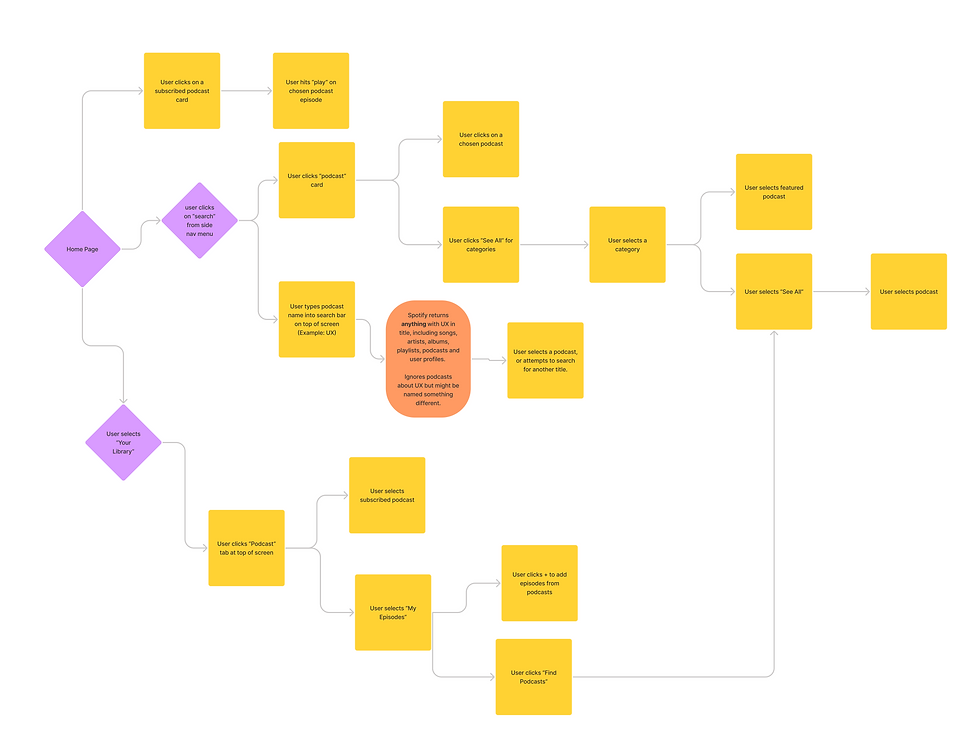
One last thing I completed for discovery research was a user journey map. This allowed me to check the flow the user follows while in the app. It exposed a major issue- the search often led to a dead-end as it would only return results with the search term in the title, and missed several possible options because it did not include the search term in the title- even though it could be the topic of an entire podcast or an individual episode.
User Journey
Design
Redesign Priorities
-
Divide the podcast and music offerings in a way where the user can create two separate playlist queues
-
Update search to include topic selection based on tags
Sketches
After analyzing the issues faced by podcast listeners using the Spotify app, I explored various options for addressing them. I initiated the design process with low-fidelity sketches and wireframes to facilitate decision-making through visualization. These sketches were informed by initial user interviews, business goals, and heuristic evaluations. They consistently highlighted the need for better separation between music and podcasts within the app. Our exploration included considering a standalone podcasting app, using tabs to segregate the two platforms, and implementing a swipe gesture to switch between music and podcasts.
Wireframes
I used Figma to translate two of my sketches into low-fidelity wireframes. After testing quick prototypes with four different users, we determined that the swipe gesture was a modern yet familiar way to switch between panels, receiving the highest approval.
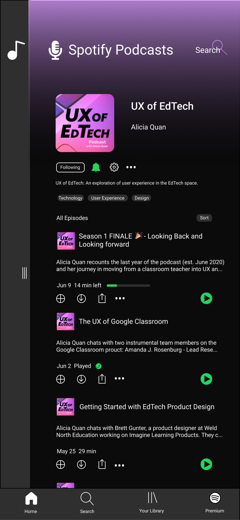
Additionally, I explored alternative methods for discovering on-topic podcasts. I settled on a tag option, where podcast publishers could choose up to five pre-determined tags to label their content. The Spotify team would periodically evaluate these tags to ensure effectiveness and address any gaps. Listeners could then tap a tag to discover related podcasts with the same label.


High Fidelity Designs


Next Steps
Further iterations may also include a way to filter podcasts using multiple tags at a time. Certain tags including "comedy" may return too many choices, leaving a user still browsing through multiple pages to find what they are looking for. Being able to choose "comedy" and "stage performances" together will limit the return.
A deeper dive into the search capabilities of the app, including the paradigms and algorithms used might be an interesting investigation and might yield insights on further capabilities such as voice search and control.
3
2
1
There was no final usability testing on the design. I would like to get my design in front of a group of people to test things such as accessibility and task success. Is the swipe feature identifiable enough that a user will be able to navigate the app on a first pass?
Learnings
As I reflect on this project, I’m reconsidering some of my design choices related to accessibility. Is swiping the most user-friendly way to access information, especially for those with larger phones? Additionally, I wonder about the visual aspects of the design. While I borrowed the overall style from Spotify’s branding, I question whether Spotify is doing enough to ensure visual accessibility for all users.
Overall, I’m thrilled with how this redesign turned out! Users in our target demographic are accustomed to swiping, making it a natural and intuitive way to switch between music and podcasts within Spotify. This approach eliminates the need for separate apps, saving valuable space on their devices. Although a tab-based design could work, it feels dated and less appealing. By placing podcasts on a separate screen from music, users can organize their content more effectively without a chaotic mix on a single screen.
My favorite enhancement, despite its simplicity, is the addition of search tags. Allowing podcasters to tag their content would greatly improve searchability and enhance the overall user experience.
Thank You!
I listen to all my podcasts on Spotify. Since completing this case study in 2020, several updates have occurred in the app making it much easier to use, including improvement of the algorithm suggesting new podcasts based on my interests.
Thanks for reading!